

Brand stories
Without a Huge Budget — Just Clear Direction
A premium feeling isn’t bought with money — it’s built through consistency and calmness.
When everything feels intentional, people naturally feel trust.
1) Quiet Instead of Fireworks
Luxury often speaks softly.
Use fewer elements and keep them consistent:
the same headline style, the same type of photography, the same two or three color tones.
Less really is more here.
2) One Story, Everywhere
If your brand feels warm and calm, it should feel that way everywhere — on your website, business cards, and Instagram.
People trust consistency:
the same atmosphere, the same visual handwriting.
That’s what creates recognition.
3) Images That Don’t Try Too Hard
Photography should feel real:
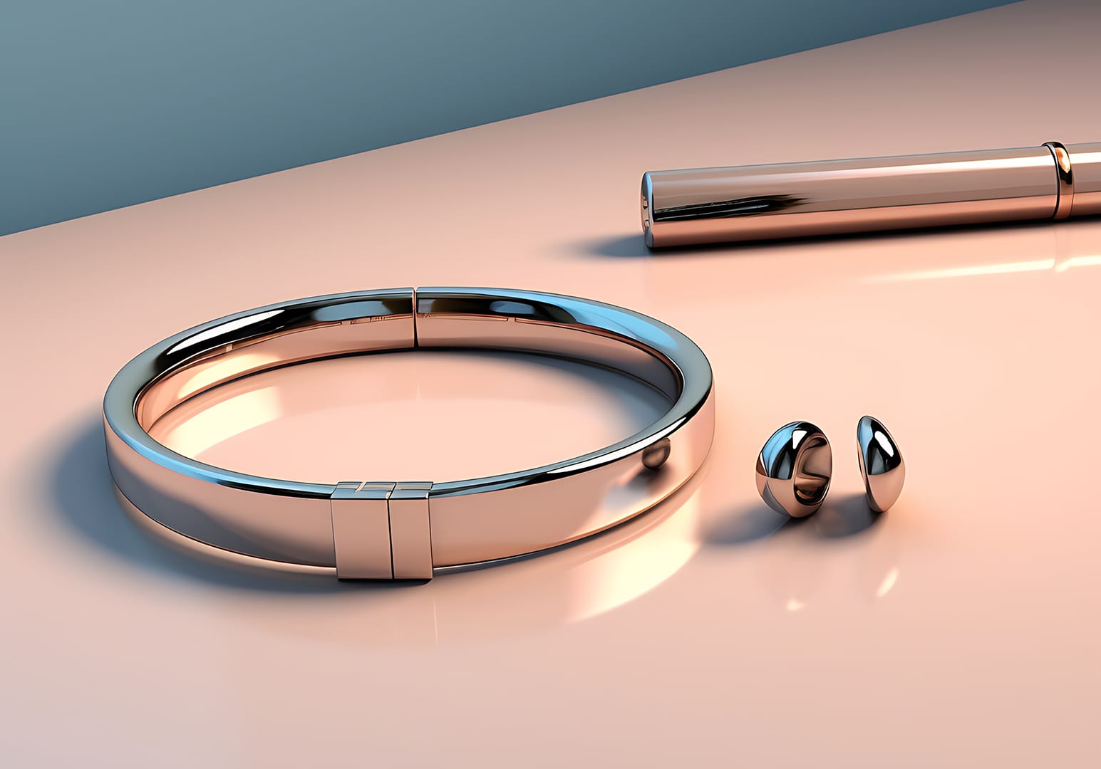
close-up products, visible textures, natural light.
One consistent visual style across all channels feels far more premium than a hundred different filters.
4) Small Rituals of Order
Equal spacing. Calm layouts. Buttons that invite instead of shout.
These are the details nobody consciously notices — but everyone feels as “professional”.
5) One Signature, Not Three
Choose one accent color and use it carefully:
on a button, a highlight, or a subtle detail.
When everything else stays neutral, that single signature feels premium.
6) Words That Breathe
Write clearly and simply.
No exaggerated promises.
No unnecessary exclamation marks.
A calm tone creates confidence — and confidence feels luxurious.
“Premium doesn’t mean expensive. Premium means consistent.”
7) Patience Is Part of the Style
Don’t redesign everything every week.
Give people time to recognize your look and feel.
When a brand has rhythm, it develops character — and character is what people remember.
Want your brand to feel more premium?
Start with calm structure and quiet consistency.